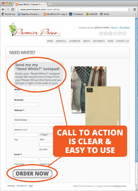
Call To Action
We moved into a house last year with a broken outdoor faucet by the driveway. It’s not one of those ordinary hose bibs, it is a hot & cold mixer faucet like you might see on a utility sink. It seems that hot & cold faucets are unusual enough that they dont have it at the corner hardware store or the big box stores. After a five minute web search I found the faucet manufacturer, and their online storefront. Cool, I’ll be able to get my faucet fixed! A few minutes later I have an account, got the parts I need in my shopping cart, enter my credit card info, and, WHAM!
Theres no button to place my order! There’s a message that tells me not to click twice on the button, but no button.
Which brings me to the topic of this blog post.

What is a CTA?
The call to action (CTA) is a brief message that tells the person what to do next. When what you want the person to do next aligns with their goal, you’re one step closer to a sale.
Who should see your CTA?
- A visitor on your web site
- A prospect on a landing page
- An email reader
- A prospect holding your printed direct mail in her hand
On a web page or other interactive medium like a mobile app, the call to action is typically a button or a clickable link. On a printed piece it is a message that stands out from the rest of the design. If you’re trying to facilitate mobile traffic the CTA might be a QR code or digital watermarking technology like Digimarc® Discover.
Whatever the medium, the CTA should always:
- Use colors, size, fonts and white space so it stands out
- Be positioned so the eye is drawn to it
- Be obvious as to what will happen
- Use active and urgent language
Each of these elements can have a huge impact on conversion rates.
Usability
In an interactive medium such as a web page or phone app, design means much more than graphical design of the page with the call to action. On a computer with a mouse, having the CTA highlight when the cursor passes over it confirms that something will happen when clicked. After clicking, the information displayed, whether it is a new web page or more information that slides out, needs to support the message in the CTA.
The design theme should be carried on throughout the process so that the user is not surprised. If the CTA is to fill out a form and sign up for a newsletter, dont dump the user onto your web site when done. Have a thankyou page with the same design theme and have a link to your website instead, this sets the expectation for the context change when the link is clicked.
The same holds true for direct mail or a QR code on a banner at an event. The design theme on the printed piece should always be used on the campaign landing pages.
While thinking through design and usability will likely result in a reasonable call to action it is important to test on a regular basis. Every audience and every campaign is different, so what worked great last time may not have the same affect in the future.
Have a call to action on every page of your website
Dont make the assumption that everyone that visits your site will come in through the home page. Our analytics on our home page tell us that in the last month about 1/3 of our visitors land on our home page first. This means that the first page that 2/3 of our web site visitors see is not the home page. The first page someone sees might be detailed services information, our contact page, or a blog post. Be sure that every page on your web site has an obvious next step for your visitor to further their relationship with you.
Oh, and the faucet? I still haven’t ordered the parts. I’m going to take it apart and see if I can’t make the parts I have work.
Please contact your sales rep or Contact Us if you’d like some ideas for your next campaign.