
Kita Lookbook
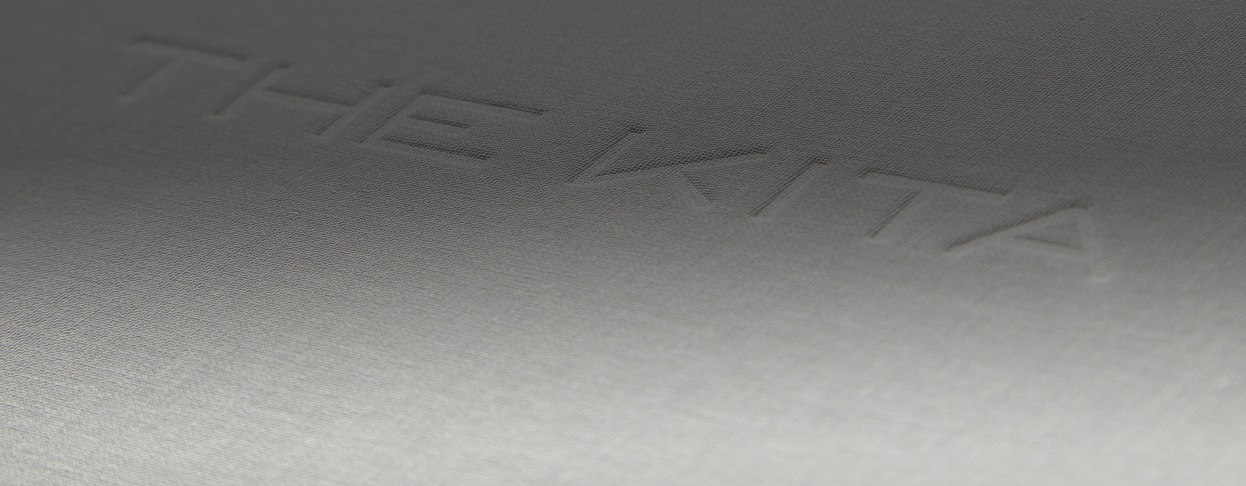
Kita is a high-end real estate developer. How high-end? Let’s just say that if you purchase the $25 million condo, they’ll throw in a Rolls Royce. The company aims to sell their properties before they’ve even broken ground, using a “lookbook” to showcase all their premium materials and designs. Needless to say, the book has to be a work of art. It is; it has a debossed linen cover, Swiss-bound, with 108 pages of photography using three different paper stocks: 80# Via Carnival Felt, 100# Sterling Matte Text, and 100# Via Vellum warm white.

Premier’s role in this major project earned us the “Best of Binding, Case” at the 2019 Pacific Printing Industries Association Printrocks! competition.
As the output channel, our challenge was this: the book was a reprint of one that had been printed in Japan using a special gray Italian linen for the cover, but the tight timeline prevented sourcing the same material. Instead, we started with a Verona 601 white printable linen, and used the sophisticated software on our IS29 digital press to exactly emulate the original gray with our four-color process. What’s more, the book comes in a set of three, each in a different language, so we had to do three different production runs, and ensure that the color matched perfectly across each of the runs.
Related Work

Kyle Bunting: High-End Catalog Printing for a Tactile Brand

Subtle, Strategic, and Sensory Catalog Design That Elevates the Hive Brand

Premium Event Book Printing: Crafting the TEDx Portland Keepsake

The Gold Standard of Print Magazines Exudes Luxury & Elegance


