
Responsive Web Design for Mobile
Mobile first and more recently Multi-screen are hot topics for marketers these days. People – your customers and prospects – are not constrained to their computer when answering your emails, reading your blog, and researching competitive information. They bounce between their laptop or desktop computer and mobile phone throughout the day.
57% adults now own a smart phone. Mobile traffic share on our own web site has increased over 38% in the last year. This table shows the percentage of people that use their smart phones for tasks they used to have to do on their computer.
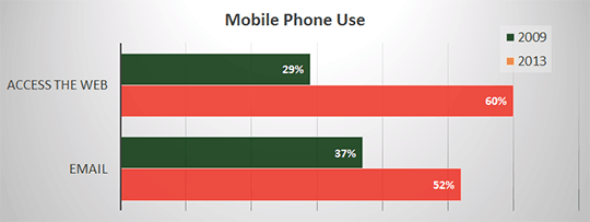
Cell Phone Activities 2013 | Pew Research Center
Not too long ago you either had to build a separate mobile version or versions of your web site or have your site visitors suffer through a mediocre or worse experience. With the wide variety of smart phone screen sizes and users preferences of viewing web sites in a portrait or landscape orientation, it is impossible to optimize your web site for all combinations.
Responsive Web Design
New web design methodologies allow a site to adapt, or respond, based on the size and type of device that is being used. Heres some examples of what responsive design can do:
- Images resize
- Web site width changes
- Menu design changes to maximize usability using a mouse or touch screen
- The entire page layout changes. A multiple column design on a desktop computer morphs into a single column design on a smaller mobile device.
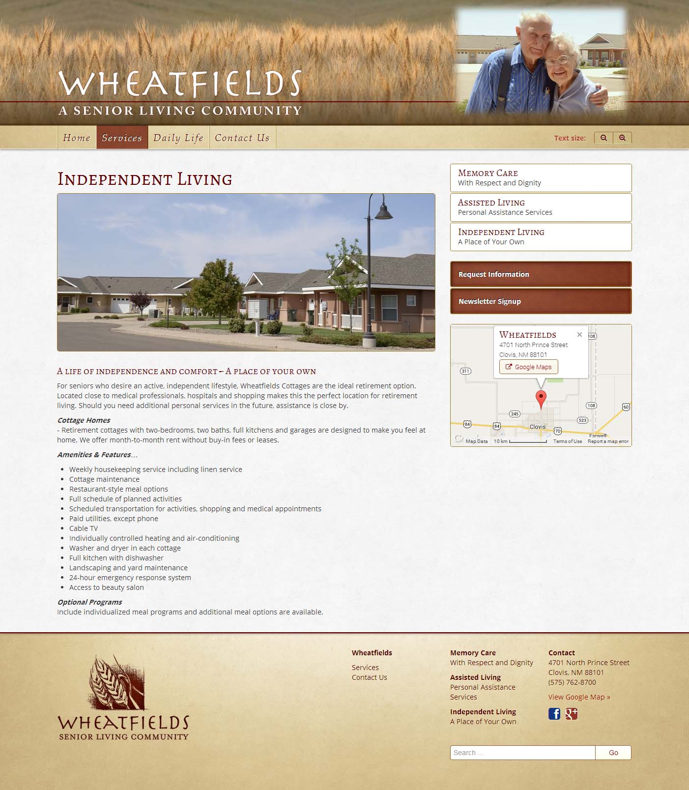
Here’s and example of how a responsive web site changes it’s layout for different devices. First, the web site as it appears on a laptop computer.
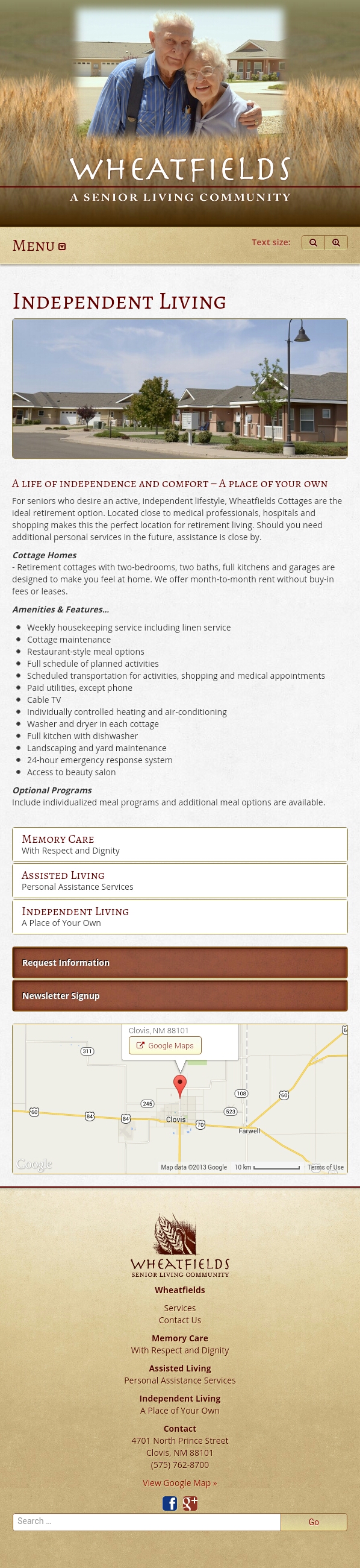
The following two images show how the same responsive web page appears on a smart phone in portrait and landscape orientations.

You can see this for yourself by viewing our website in your desktop and smartphone browsers. You can also check out out this blog post, or any page on the Premier Press website to see another example.
Responsive Web Site or Mobile App?
Whether to create a responsive web site or a mobile app is typically not an either/or decision. A mobile app can be a great solution if your audience logs into your web site, spend a significant amount of time on your site, and access a lot of data. A mobile app can be optimized for the tasks a user is trying to accomplish, and an app can be quicker since only data, not user interface components, need to be downloaded onto the phone. But generally youll need to make at least two separate mobile apps, one for iPhones and one for Android based phones.
Even with a mobile apps in place you will likely still want a responsive web site. When you send emails with links to your website people will click through on any type of device. Someone browsing your site on their phone may bookmark a page for later viewing on their desktop or email the page URL to a colleague.
Advantages of Responsive Design
There are numerous advantages for utilizing a responsive web site design, both for your audience and your company. These include:
- You are ready for the mobile world
- Site menus and buttons can be sized for mobile interaction
- Links can be bookmarked and shared across all devices
- Better SEO since the same URLs are used
- The web site display works on every device
- Save money one web site to create and maintain
Implementing Responsive Web Design
Modifying your current web site to support adaptive design might be a significant development project depending on the complexity of your site and how it is implemented.
For a new web site design project, making the design responsive should not add a huge increase in the cost or lead time of the site design. It does require additional design decisions, adaptive web design skills, and testing, but it is much less expensive than building separate mobile sites for other devices.
Action Item
If you havet yet implemented a mobile ready web site take a look at your website in your smart phone, borrow one if you need to. Hold the phone both vertically and horizontally. Read some of your copy and navigate through a few pages.
Not happy with what you are experiencing? Contact us and we’ll be happy to review your web site and discuss what it will take to make it ready for a mobile world.
Related Blogs
What Is Sleeking? A Guide to Digital Foil
The New Premier Press Website: Your End-to-End Brand Partner

How Premium Packaging Design Transforms the Customer Experience
Influencer Packaging That Stole the Show


