Bold New Colors Reinvigorate Grön’s Pearl Packaging
Grön, one of Oregon’s largest producers of cannabis-infused edibles, has stayed ahead of the competition and established itself as a top pick for consumers seeking high-quality, health-conscious products.
Now available in 10 states and celebrating its 10th business anniversary, Grön’s team began exploring possible new branding to add even more umph to its beloved Pearls product line.
Through collaboration with our design team, we found that a new packaging design wasn’t necessary — but entirely new, proprietary colors would recharge the packaging with lasting appeal.
A Striking Rebrand Using Color Only
Full-scale rebrands require significant resources and may erode well-established brand recognition. Although some organizations thrive after a total redesign, others find the investment is not always worth the return.
Grön prepared new design concepts and conducted focus tests to determine if customers would respond well to revamped packaging. Customers liked the new designs, however, they also felt there was nothing wrong with the existing designs — no need to overhaul something that is already recognized and loved.
With this feedback in mind, Grön came to us as a thought partner to explore ways to enhance the packaging’s appeal with its existing design. We collaborated with our ink vendor to create something entirely new: A proprietary color that looks fluorescent and adds a powerful punch to the already loved design.
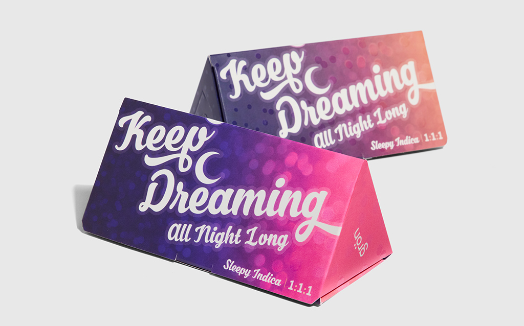
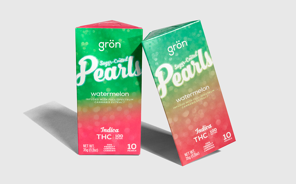
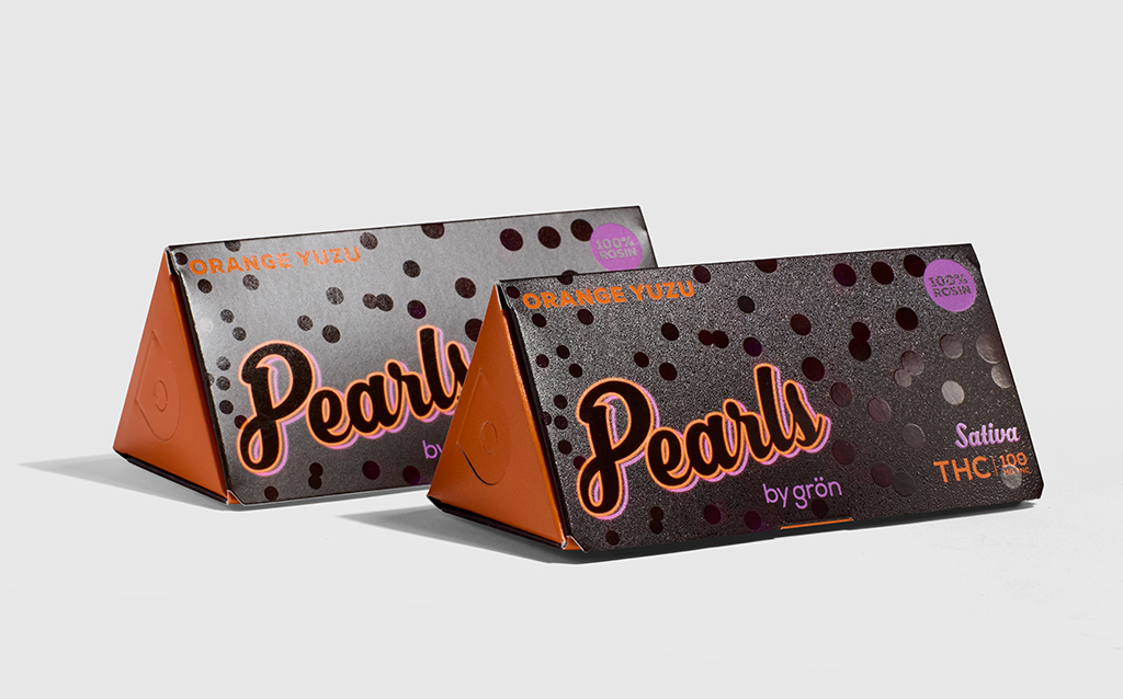
- The packaging design is unique and clear, featuring a recognizable triangle shape with subtle circle patterns that mirror the gummy shape.
- The original colors are deep and rich, however, they may seem more muted compared to other brands that rely on bright, neon colors.
- Proprietary colors used only by Grön significantly brighten the packaging and showcase the design in stunning new detail.
A Budding Partnership Grown With Respect
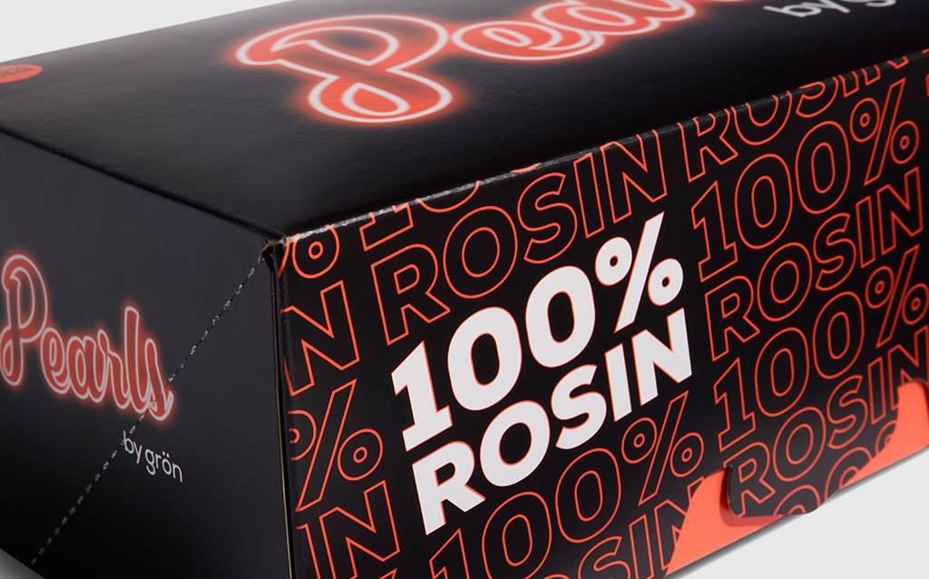
Grön has partnered with our team for several years, ensuring its cannabis-infused edibles packaging reflects a consistent brand identity and honors its commitment to sustainability, fairness, and minimal environmental impact. We’ve also collaborated on attention-grabbing seasonal rollouts, like using glowing inks for the 2024 Flavor Double Feature.
Our expert designers and product packaging innovators love to bring seemingly impossible ideas to life and help clients strike the right balance of quality, cost, and ingenuity based on their goals. In our latest work with Grön, this meant punching up its existing colors for a highly cost-effective yet impactful packaging refresh that preserves its brand awareness.
If your team is considering a packaging refresh or looking for other ways to connect with your customers, we’re eager to help.